Lorem ipsum dolor sit amet, consectetur adipiscing elit. Ut elit tellus, luctus nec ullamcorper mattis, pulvinar dapibus leo.

Work Inquiries:

© 2025 Flashyminds All rights reserved. Crafted with passion by the Flashyminds team.

Edit Template

Creating a Brand Identity for SAS Pure Water

SAS Pure Water is a premium bottled water company focused on delivering pure, reliable, and high-quality hydration. The brand needed a clear and memorable identity that communicates purity, trust, and premium quality in a highly competitive market.

Client:

SAS Pure Water

Industry:

Food & Beverage | Bottled Water

Client Type:

Manufacturing & Retail

Market:

B2C

Services:

Branding, Creative Graphic Design

Timeline:

July 2024

Slide 16 9 3 | Creating a Brand Identity for SAS Pure Water | Flashyminds

The Challenge

The bottled water market is highly saturated, with many brands using similar visual cues around purity and freshness. SAS Pure Water struggled with brand recognition, and their earlier branding lacked a strong visual connection to the product’s core attributes.

1
Communicating purity and premium quality clearly
2
Standing out on shelves in a crowded retail environment
3
Building trust through visual identity alone

Our Branding Approach

We adopted a strategy-led branding approach rooted in user perception and market differentiation.

Developed a branding strategy aligned with SAS Pure Water’s vision and values

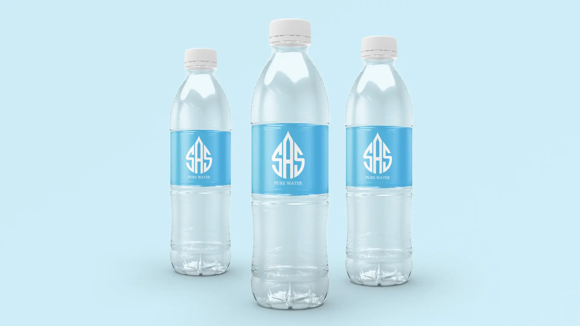
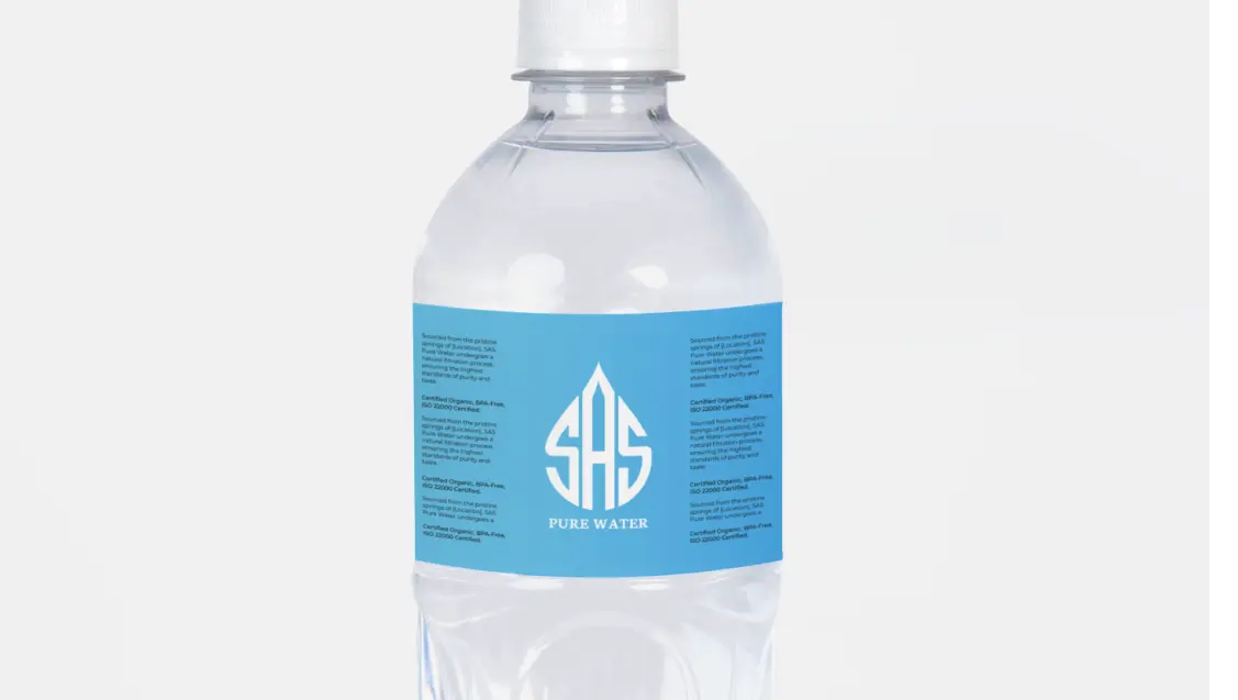
Designed a custom vector logo where the “SAS” lettering forms a water droplet, symbolizing purity

Created a color palette using fresh blue gradients and clean white tones to convey freshness and trust

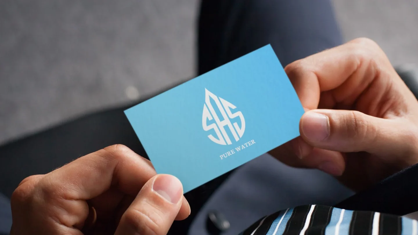
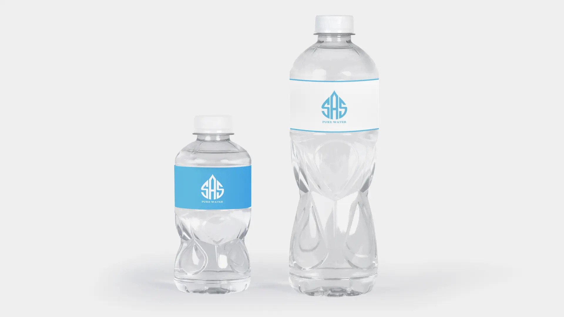
Applied the identity across flyers, banners, and promotional materials

Designed supporting visual elements like wave graphics and ripple effects for consistency

Brand Impact

The new brand identity delivered clear and measurable brand improvements:

1
A distinctive logo that visually communicates purity and premium quality
2
A unified color palette that improves shelf visibility and brand recall
3
Consistent typography and graphic elements across all marketing assets
4
Stronger visual differentiation in a competitive bottled water category

Overall Summary

This branding project for SAS Pure Water highlights how a strategic visual identity can elevate brand recognition in saturated consumer markets. The engagement included branding strategy, logo design, and creative graphic design for marketing assets such as flyers and banners. A custom water droplet-inspired logo, a cohesive blue-and-white color palette, and consistent typography were developed to reinforce the brand’s values of purity, freshness, and trust. Every element was designed for scalability across packaging, retail, and promotional use. As a branding agency in Bangalore, Flashyminds focuses on creating brand identities that combine strategic thinking with strong visual systems, helping consumer brands stand out, build credibility, and drive long-term market presence.

Scroll to Top